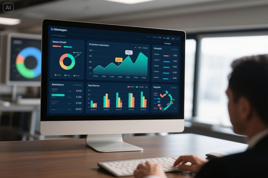
Data Visualization & Dashboarding: See Your Data Clearly, Act Confidently
Interactive dashboards that turn complex data into easy-to-understand visuals. Empower your team with real-time insights and make smarter decisions faster.
In today’s data-driven world, organizations and individuals are inundated with vast amounts of information. However, raw data alone is often difficult to interpret. This is where data visualization comes in—transforming complex datasets into clear, intuitive visuals that reveal patterns, trends, and actionable insights.
Data visualization is the graphical representation of information, using charts, graphs, maps, and dashboards to make data more accessible. Key benefits include:
Clarity & Understanding: Visuals help people grasp complex data quickly. A well-designed chart can convey insights faster than spreadsheets or reports.
Pattern Recognition: Trends, outliers, and correlations become obvious when visualized, aiding decision-making.
Engagement: Visual storytelling captures attention more effectively than raw numbers, making presentations and reports more compelling.
Real-Time Decision Making: Interactive dashboards allow businesses to monitor KPIs and respond swiftly to changes.
Common Types of Data Visualizations
Different visualization techniques serve different purposes:
- Bar Charts & Column Charts – Compare categories (e.g., sales by region).
- Line Graphs – Track trends over time (e.g., stock prices).
- Pie Charts – Show proportions (e.g., market share).
- Scatter Plots – Reveal relationships between variables (e.g., correlation studies).
- Heatmaps – Display density or intensity (e.g., website clicks).
- Geospatial Maps – Visualize location-based data (e.g., delivery routes).
- Dashboards – Combine multiple visuals for real-time analytics.
Best Practices for Effective Data Visualization
To maximize impact, follow these principles:
- Know Your Audience: Tailor visuals to their level of expertise.
- Simplify: Avoid clutter; highlight only the most important data.
- Choose the Right Chart: Match the visualization type to the data story.
- Use Color Wisely: Ensure contrast and accessibility (avoid misleading color schemes).
- Label Clearly: Titles, axes, and legends should be descriptive.
- Make It Interactive (When Possible): Allow users to explore data dynamically.
Tools for Data Visualization
Several tools make visualization accessible to professionals and beginners alike:
- Tableau – Powerful for interactive dashboards.
- Power BI – Microsoft’s business analytics solution.
- Google Data Studio – Free and cloud-based.
- Python (Matplotlib, Seaborn, Plotly) – Great for custom visualizations.
- D3.js – A JavaScript library for advanced web-based visuals.
With advancements in AI and machine learning, automated insights and real-time visualizations are becoming more sophisticated. Augmented reality (AR) and virtual reality (VR) are also emerging as new mediums for immersive data exploration.
Why Data Visualization Matters
In the rapidly evolving landscape of modern business, decision-makers need instant access to clear, actionable insights. Raw data, spreadsheets, and lengthy reports often obscure critical information, leading to delays and missed opportunities. Data visualization and dashboarding transform complex data into intuitive, interactive visuals, enabling leaders to act with confidence and precision.
The Challenge:
Businesses face:
- Overwhelming amounts of data from multiple sources.
- Difficulty identifying trends or patterns in raw data.
- Time-consuming manual analysis and reporting.
- Lack of real-time insights to support quick decision-making.
The Opportunity:
Data visualization and dashboards enable businesses to:
- Simplify complex data into actionable insights.
- Monitor key metrics in real time.
- Identify trends, outliers, and opportunities at a glance.
- Improve collaboration and alignment across teams.
How We Help
We specialize in creating dynamic, interactive dashboards tailored to your business needs. Our solutions provide real-time visibility into critical metrics, empowering you to make data-driven decisions with confidence.
Our Approach:
- Requirement Gathering:
We work with you to identify key metrics and data sources that matter most to your business. - Design & Development:
Our team designs intuitive, user-friendly dashboards that align with your goals and workflows. - Integration:
We connect your dashboards to live data sources for real-time updates. - Customization:
Dashboards are fully customizable, allowing you to drill down into details or view high-level summaries. - Training & Support:
We provide training to ensure your team can use dashboards effectively and offer ongoing support for updates and enhancements.
Real-World Example: Healthcare Transformation
Client: A healthcare provider struggling with long patient wait times and inefficient resource allocation.
Challenge:
- Lack of real-time visibility into patient flow and resource utilization.
- Declining patient satisfaction scores due to delays and inefficiencies.
Solution:
- We developed an interactive dashboard to monitor patient wait times, staff availability, and resource allocation in real time.
- The dashboard provided actionable insights to optimize scheduling and resource deployment.
Results:
- 18% improvement in patient satisfaction scores within six months.
- Reduced wait times by 25%, leading to better patient experiences.
- Enhanced operational efficiency and staff productivity.
Key Benefits of Data Visualization & Dashboards
- Real-Time Insights: Monitor key metrics and trends as they happen.
- Improved Decision-Making: Act quickly with clear, actionable data.
- Enhanced Collaboration: Share insights across teams for better alignment.
- Time Savings: Eliminate manual data analysis and reporting.
- Scalability: Adapt dashboards as your business grows and evolves.
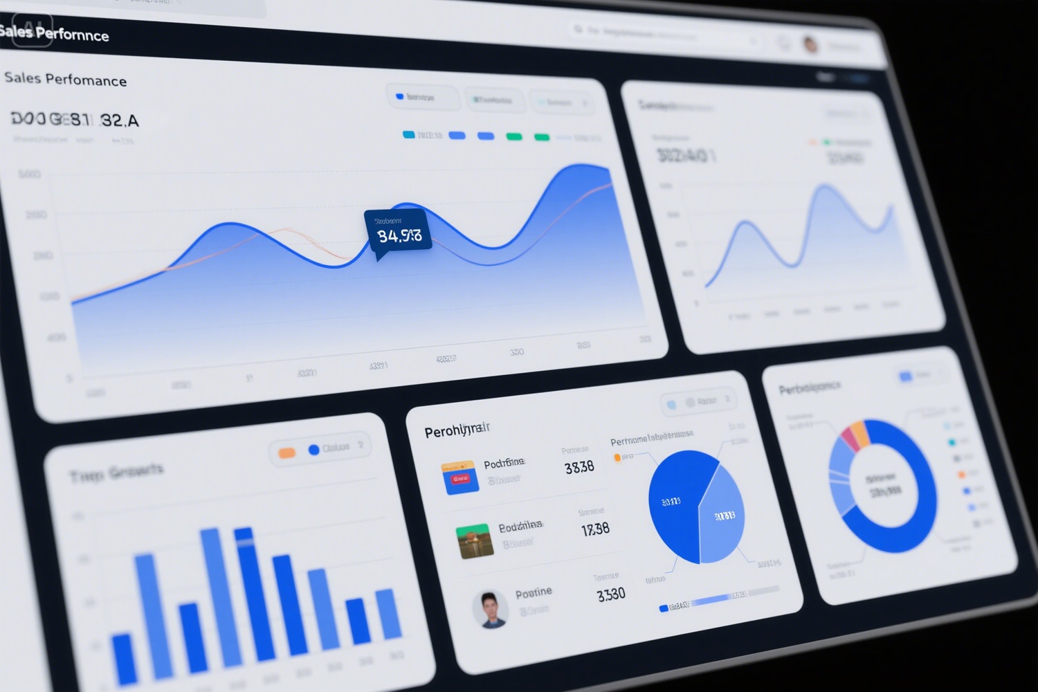
Sample Dashboard
Dashboard Title: Sales Performance Dashboard
This sample dashboard provides a snapshot of sales performance, including revenue trends, top-performing products, and regional comparisons.
Why Choose Us?
- Expert Design: Our team creates visually appealing, user-friendly dashboards.
- Custom Solutions: We tailor dashboards to your specific needs and goals.
- Cutting-Edge Tools: We use leading visualization tools like Tableau, Power BI, and more.
- Proven Results: Our clients achieve measurable improvements in efficiency and decision-making.
Get Real-Time Clarity with Custom Dashboards
Ready to transform your data into actionable insights? Let’s build a custom dashboard that empowers your team to make smarter decisions faster. Contact us today to get started!
Free Dashboard Demo
Contact us for a complimentary demo to see how our dashboards can transform your data into actionable insights.